Layout
Overview
The layout section includes general settings that apply globally to your shop.
Configuration

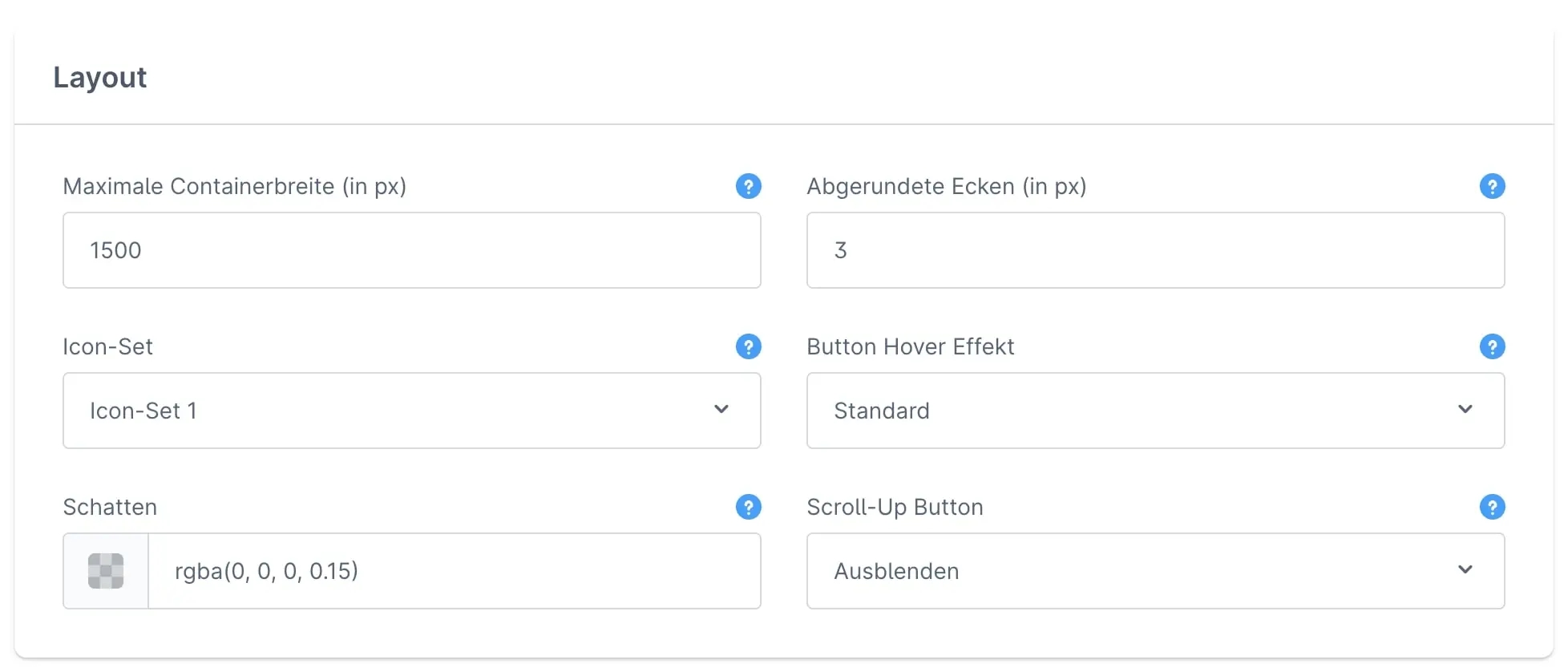
Maximum container width (in px)
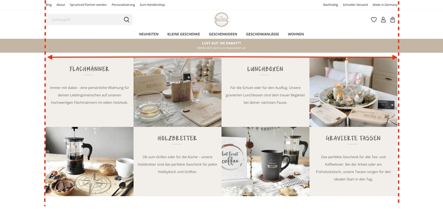
This field allows you to define the overall width of your shop. The following picture illustrates this a bit better:

Rounded corners (in px)
The theme creates frames and corners on various elements and areas in your shop. Buttons are one example of this. With this option, you can specify whether and how much your corners should be rounded. The higher the value, the more rounded they will be.
Shadows
This value represents the color and intensity of shadows at different locations in your shop.
Scroll-Up Button
Show With this setting, you can display the scroll-up button in your shop. It appears at the bottom right as soon as the visitor scrolls down the page a little. With one click, it automatically takes you back to the top of the page.
Hide The Scroll-Up Button is disabled.
Last updated
Was this helpful?


